Examples of Digital Accessibility
| Site: | Loomen za stručna usavršavanja |
| Course: | Ensuring Inclusive Access Through the Use of Assistive Technology |
| Book: | Examples of Digital Accessibility |
| Printed by: | Gost (anonimni korisnik) |
| Date: | Thursday, 17 September 2026, 4:57 PM |
1. Examples of digital accessibility
Continuous updates and new versions of the WCAG Digital Accessibility Guidelines ensure that accessibility standards keep pace with technological changes. WCAG accessibility standards have evolved over the years, with more advanced requirements added in each new version. The latest version, WCAG 2.2, was published in October 2023, and WCAG 3.0 is already in development. This version will be adapted to most modern technologies and devices, and will feature a more advanced approach to testing digital accessibility and inclusion.
Depending on how closely digital content aligns with WCAG standards, its level of accessibility varies. Three levels are distinguished: A, AA, and AAA.
According to W3C guidelines, the standard is for digital content to aim for WCAG 2.0 Level AA. This level represents the optimal balance: it provides significantly more than the minimum for accessibility while remaining realistically achievable for implementation (Sabilano, year unknown).
2. Key elements for accessible digital content
Some basic elements that accessible digital content should include, in accordance with WCAG 2.1 and 2.2 Guidelines, adapted from Webaim:
Alternative Text 🖼️
- Every non-text element requires a text equivalent, often provided in the alt attribute, to offer an alternative to the image content.
- The alt attribute should convey the content and function of the image, but does not need to provide a detailed description.
- If the image is decorative or redundant to nearby text, it should have empty alternative text (alt="").
- If the image is a link or an interactive area (hotspot), the alt text must describe the function of the link.
- Phrases such as "image of", "photo of", or "link to" are redundant, as screen readers already identify images and links by default.
- Alternative text should be as concise as possible.
Readability 📖
- Using the simplest language appropriate for the content and users.
- Using white space, such as shorter line lengths and increased text spacing, to improve readability.
- Supplementing text with images and icons.
- Checking spelling, grammar, and reading level.
Content Navigation 🧭
- Creating a semantic structure using regions, headings, and lists.
- Ensuring a skip link so that users can go directly to the main content of the page.
Data Tables 📊
- Mark data table headers with <th scope="col"> for column headers and <th scope="row"> for row headers.
- If appropriate, add a<caption> for the data table.
Color 🎨
- Colour can enhance understanding, but it is not advisable to use colour exclusively to convey information. Red and green colour combinations should be used with particular caution.
- Text, icons, and user interface elements must have strong luminance contrast.
Forms 📝
- Form labels should be placed next to or near their controls so that the labels are visually associated.
- Use the<label> element to programmatically associate labels with controls.
- Use<fieldset> and<legend> to group related controls, such as radio buttons, with a higher-level label.
- Clearly mark required form elements.
- Ensure that all instructions and guidance are easily accessible.
- Ensure that validation errors are obvious to screen reader users, and that users can easily make corrections and resubmit the form.
Links and Buttons 🔗
- Ensure that links and buttons use descriptive text.
- Avoid generic phrases such as "click here", "here", "more", "more information", "read more", or "continue".
- Ensure that links are visually distinct from other page content.
Multimedia 📹
- Live video and audio must include captions and a transcript.
- Captions must be synchronised, equivalent, and accessible.
- Archived audio must include a transcript.
Documents 📄
- For the most robust accessibility, use HTML.
- When a document is the only solution, PDF, Word, PowerPoint, and Excel offer basic accessibility features.
- If the document content cannot be made fully accessible, an accessible alternative must be provided.
- Test the document's accessibility with a screen reader.
Razno ✨
- Content should reflow without breaking the layout when zoomed to 400% from a viewport width of 1280 pixels.
- Responsive layouts and structures must be accessible via the keyboard.
- Ensure the page is descriptive.
- Ensure that all functionality is available to mouse users and is also accessible via the keyboard.
Akinyemi (2023) provides a comprehensive overview of poor and good digital content that is aligned with WCAG guidelines.
3. Principles of Accessible Content
The 'Do' and 'Don't' posters illustrate key principles for creating accessible materials for users with specific accessibility needs, including autism, blindness, visual impairment, deafness or hearing loss, mobility issues and dyslexia. The posters were designed in 2016 by UK Home Office Digital, and the Croatian version has been available since 2020 on the website of the Central State Office for the Development of Digital Society.
4. Examples of Digitally Accessible Content
Look at different examples of Universal Design for Learning (UDL).
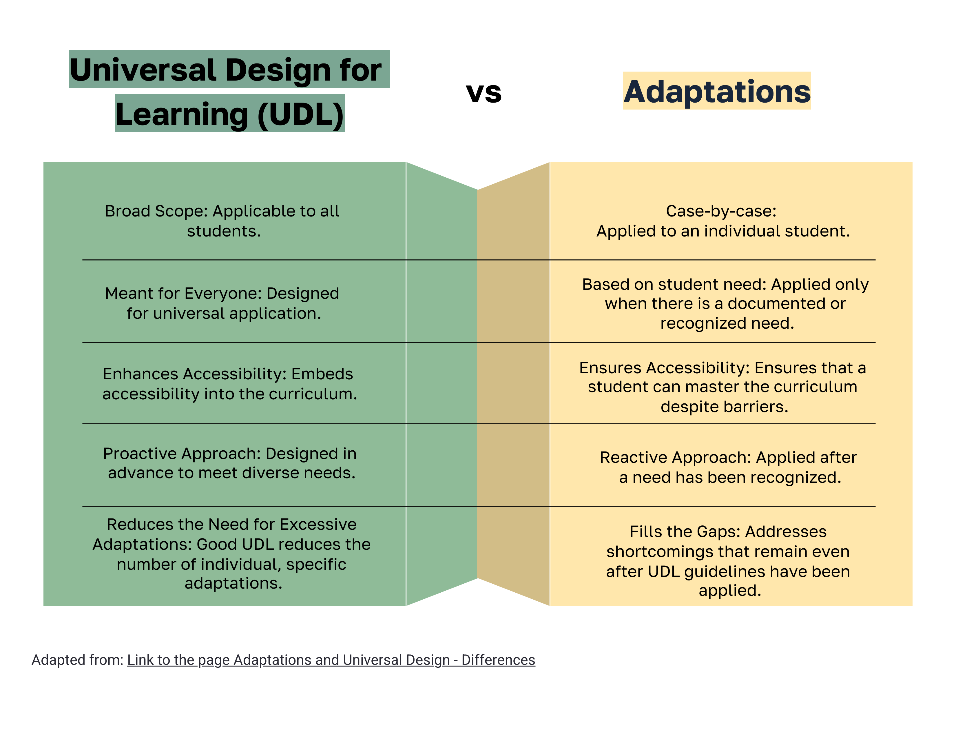
Figure 35. Display of an accessible infographic featuring colour contrast, appropriate font size, and a clearly labelled link
with the name of the content it leads to
5. Examples of Website Accessibility
Accessible websites should have the possibility of adjusting accessibility features. The website of the University of Zagreb Faculty of Education and Rehabilitation Sciences allows for the customization of its appearance (standard, high contrast, high visibility) and font adjustments (adaptation for dyslexia and font size).
The following links and documents are available in Croatian only. Participants may use free AI-powered translation tools to access the provided materials.
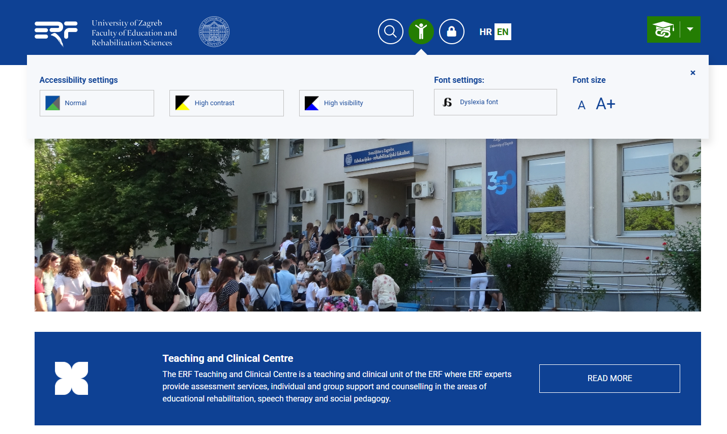
Figure 36. Website of the University of Zagreb Faculty of Education and Rehabilitation Sciences (ERF)
with accessibility adjustment options
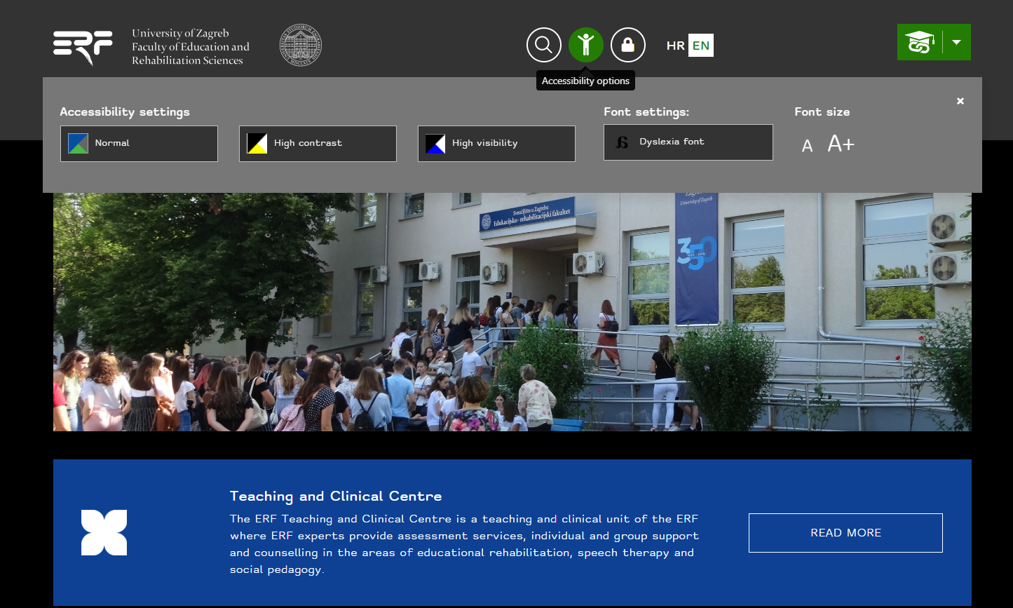
Figure 37. Customization of the ERF website: high contrast, increased font, dyslexia adaptation
In addition to customizing the appearance, size and shape of the font, the website of the Nikola Zrinski Čakovec Library also offers the option of underlined links.
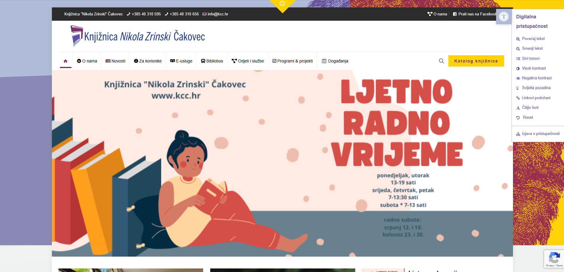
Figure 38. Accessibility adjustments on the website Knjižnice „Nikola Zrinski“, Čakovec
The website of the Croatian Union of Associations of Persons with Disabilities offers the possibility of choosing contrast, font size and shape, emphasizing links, the option to hide images and stop animations, short descriptions, a reading mask, and text alignment options. It also provides a link to the UserWay tool for checking page accessibility.
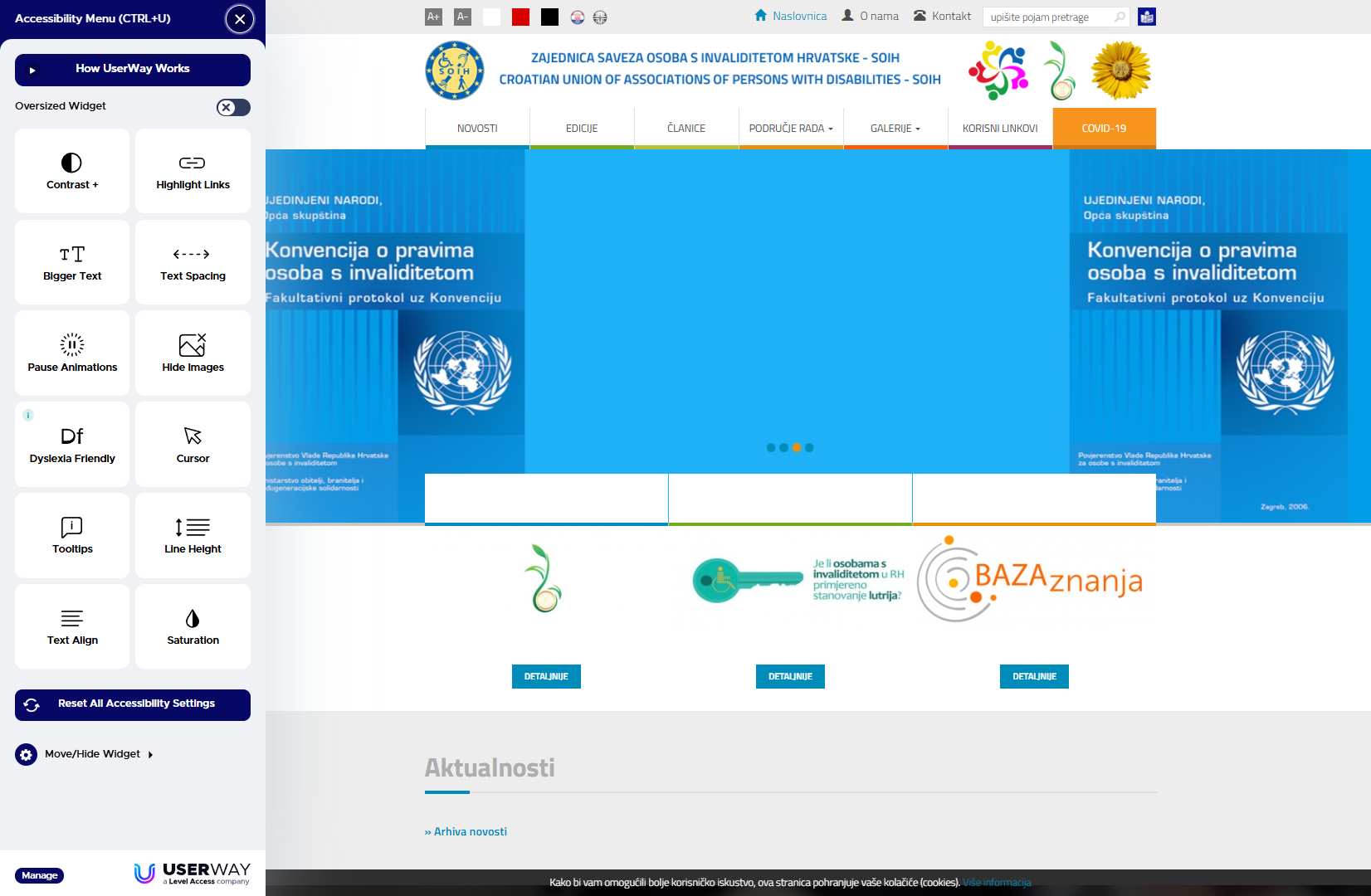
Figure 39. Accessibility customization options on the website Croatian Union of Associations of Persons with Disabilities (SOIH)
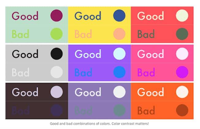
Figure 40. Examples of good and poor combinations of text and background colors
(Source)
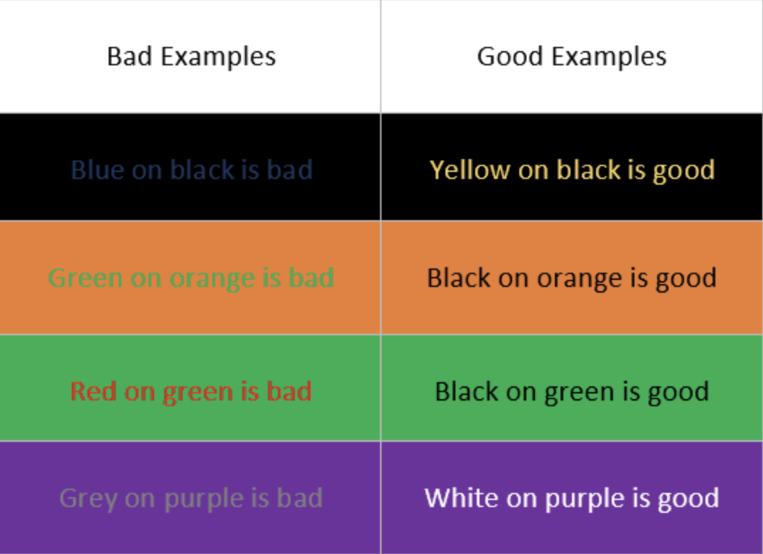
Figure 41. Examples of poor and good combinations of text and background colors
(Source)
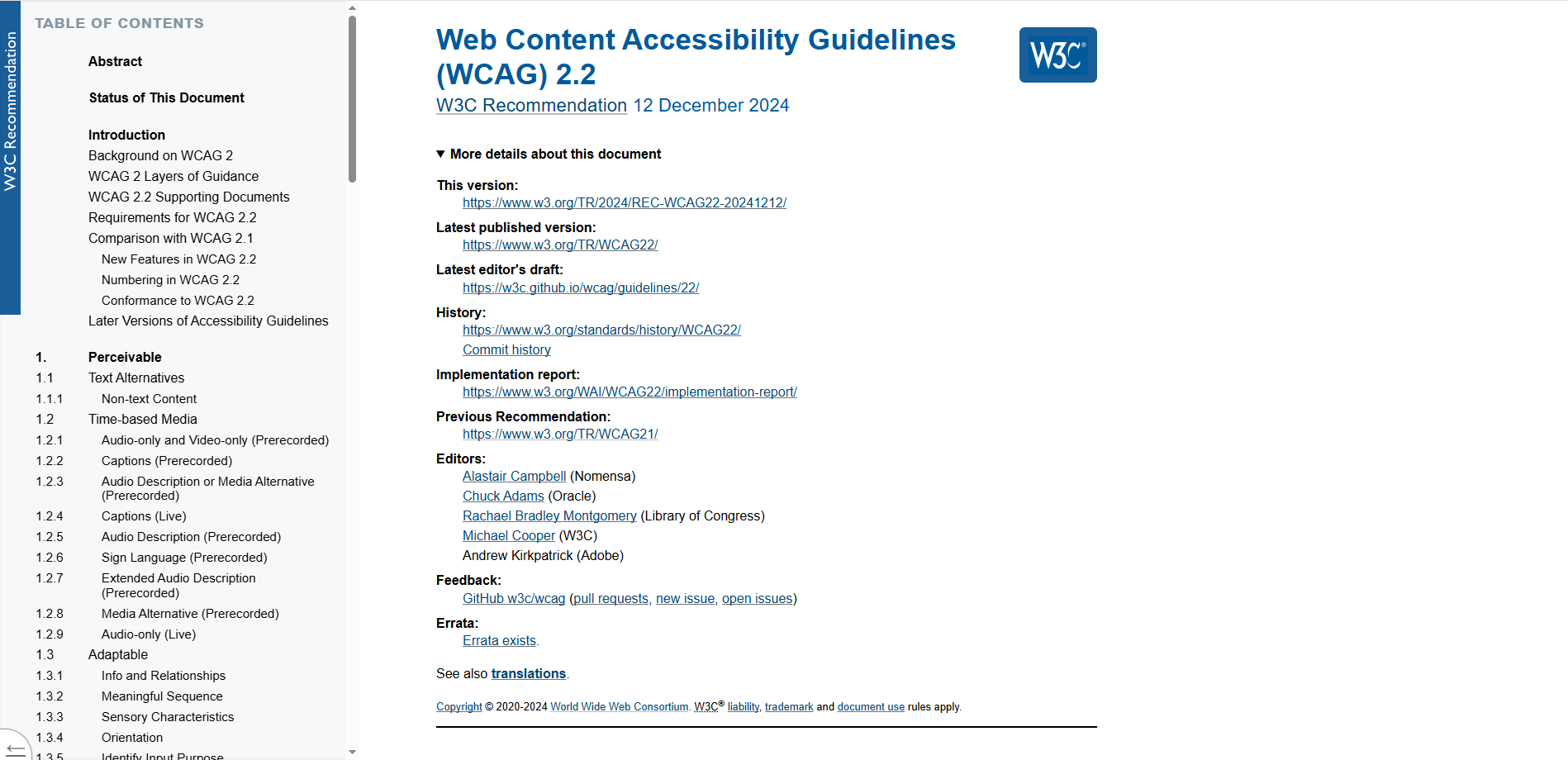
Figure 42. Application of conspicuous headings and subheadings used to mark individual chapters on the website W3C
Task: Review the website of the Ombudsman for Persons with Disabilities of the Republic of Croatia and observe the accessibility features it offers.
6. Self-Assessment and Reflection Questions
- List at least four elements that accessible digital content should contain.
7. References
Akinyemi, A. (2023). WCAG 2.0/2.1 Simplified Checklist (With Examples).
Povjerenik za informiranje Republike Hrvatske / Information Commissioner of the Republic of Croatia (2020) Accessibility of Websites and Mobile Applications / Pristupačnost mrežnih stranica i mobilnih aplikacija. Promotional materials.
Sabilano, J. (unknown year). WCAG Levels A, AA & AAA: Navigating Web Accessibility Standards.
What is WCAG Compliance? (unknown year).
Background Colour
Font Face
Font Size
Text Colour
Font Kerning
Image Visibility
Letter Spacing
Line Height
Link Highlight
Paragraph Width
Text Alignment