5. Examples of Website Accessibility
Accessible websites should have the possibility of adjusting accessibility features. The website of the University of Zagreb Faculty of Education and Rehabilitation Sciences allows for the customization of its appearance (standard, high contrast, high visibility) and font adjustments (adaptation for dyslexia and font size).
The following links and documents are available in Croatian only. Participants may use free AI-powered translation tools to access the provided materials.
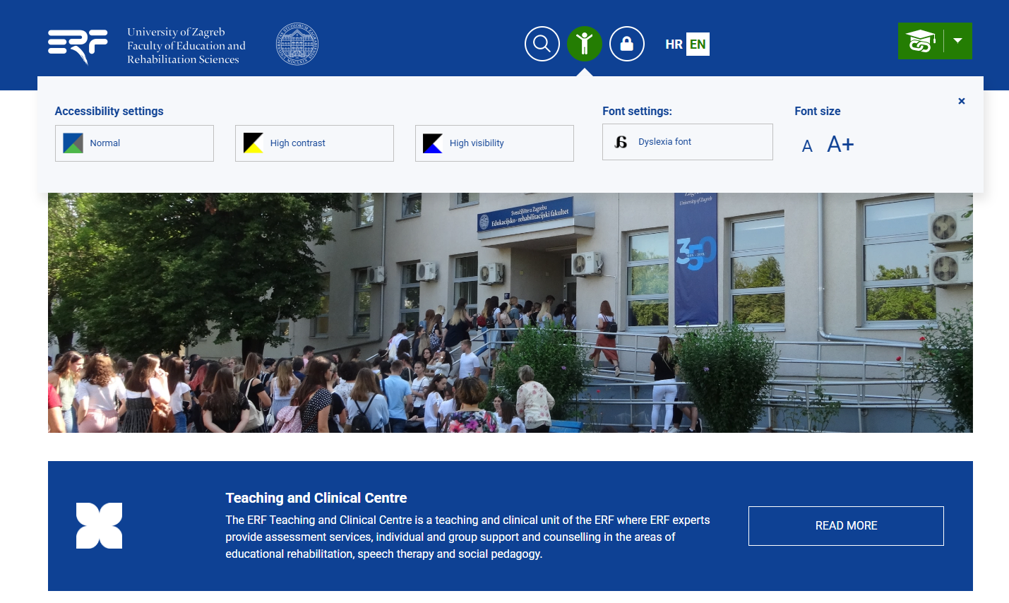
Figure 36. Website of the University of Zagreb Faculty of Education and Rehabilitation Sciences (ERF)
with accessibility adjustment options
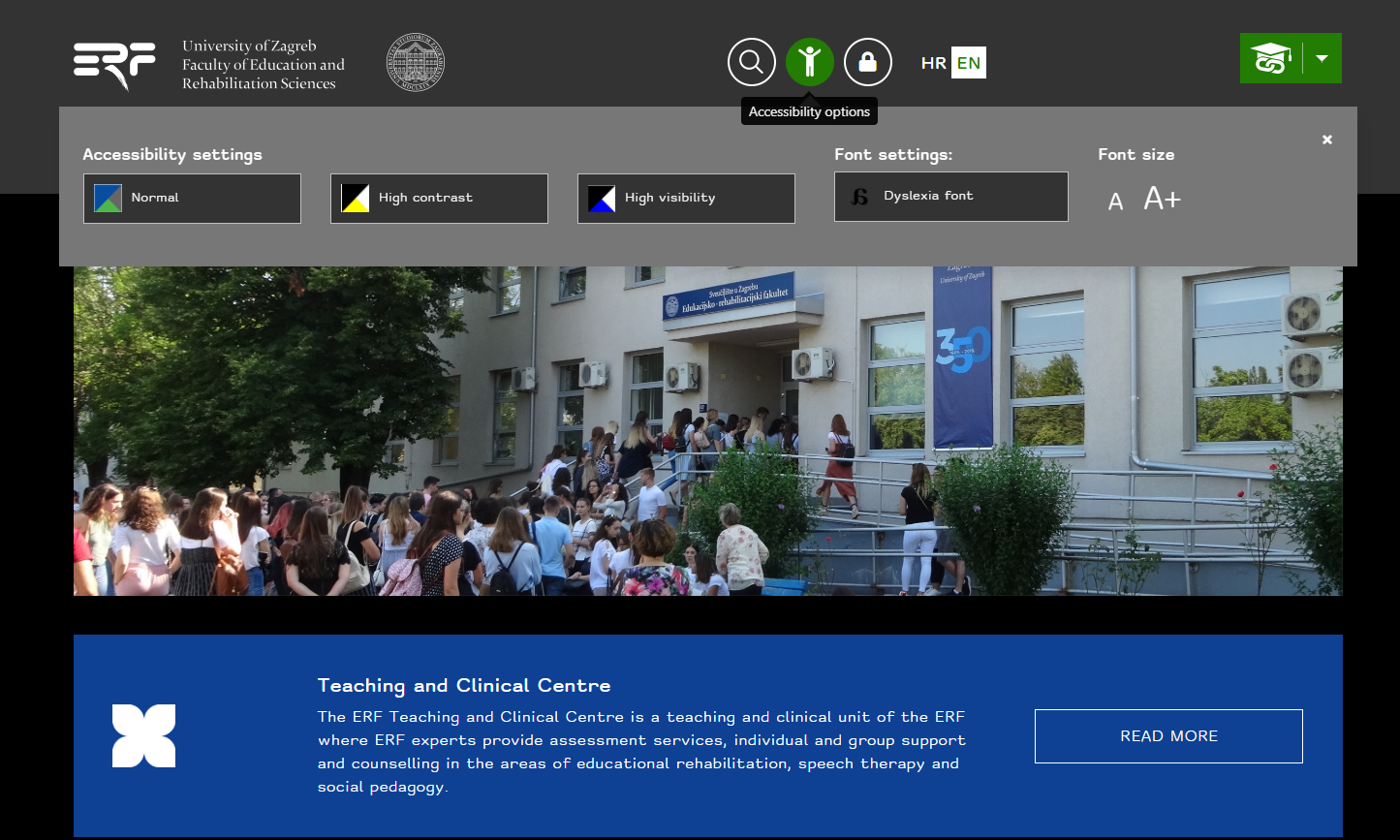
Figure 37. Customization of the ERF website: high contrast, increased font, dyslexia adaptation
In addition to customizing the appearance, size and shape of the font, the website of the Nikola Zrinski Čakovec Library also offers the option of underlined links.
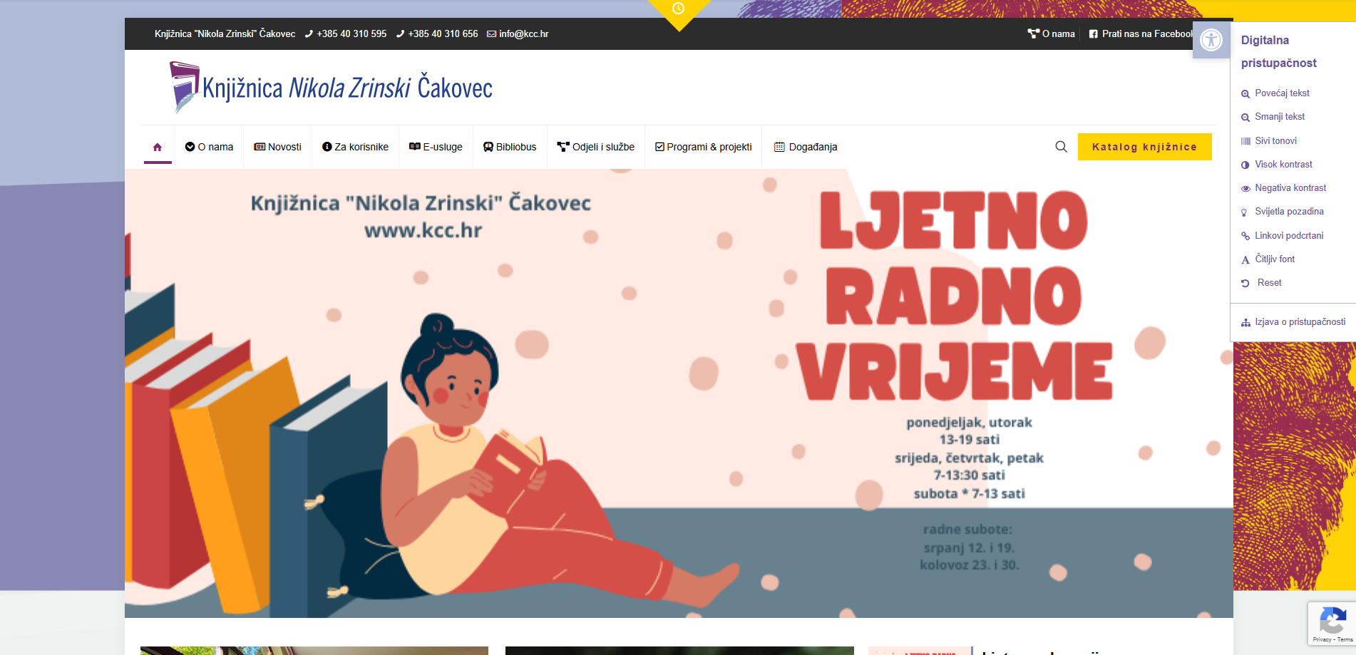
Figure 38. Accessibility adjustments on the website Knjižnice „Nikola Zrinski“, Čakovec
The website of the Croatian Union of Associations of Persons with Disabilities offers the possibility of choosing contrast, font size and shape, emphasizing links, the option to hide images and stop animations, short descriptions, a reading mask, and text alignment options. It also provides a link to the UserWay tool for checking page accessibility.
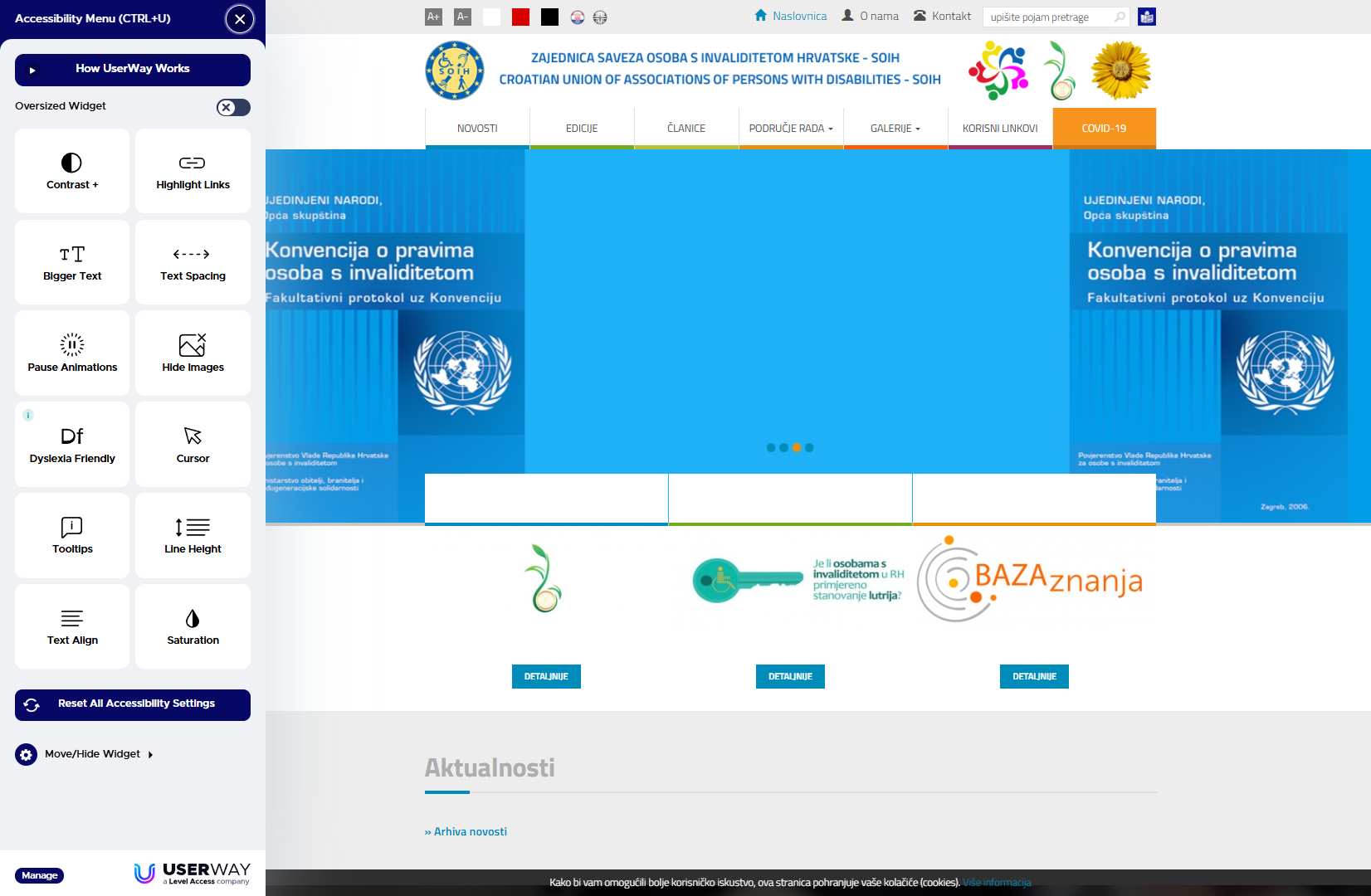
Figure 39. Accessibility customization options on the website Croatian Union of Associations of Persons with Disabilities (SOIH)
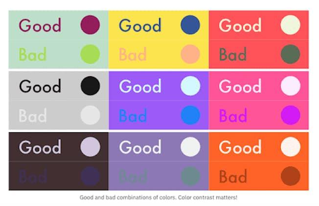
Figure 40. Examples of good and poor combinations of text and background colors
(Source)
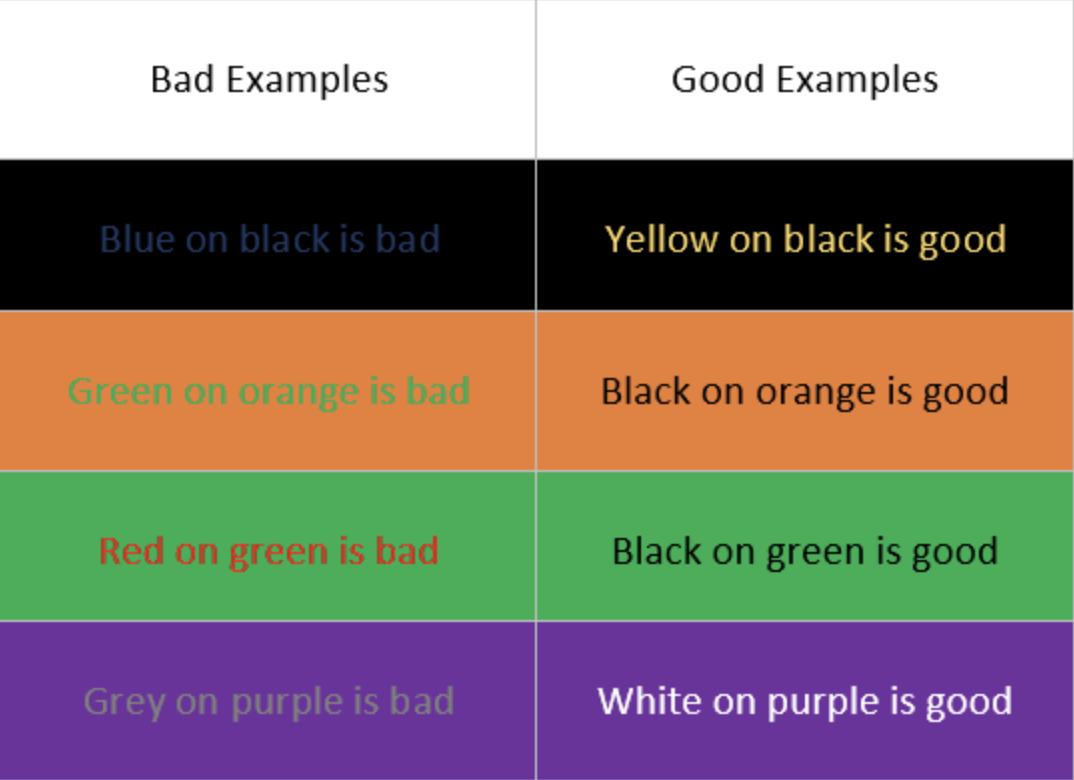
Figure 41. Examples of poor and good combinations of text and background colors
(Source)
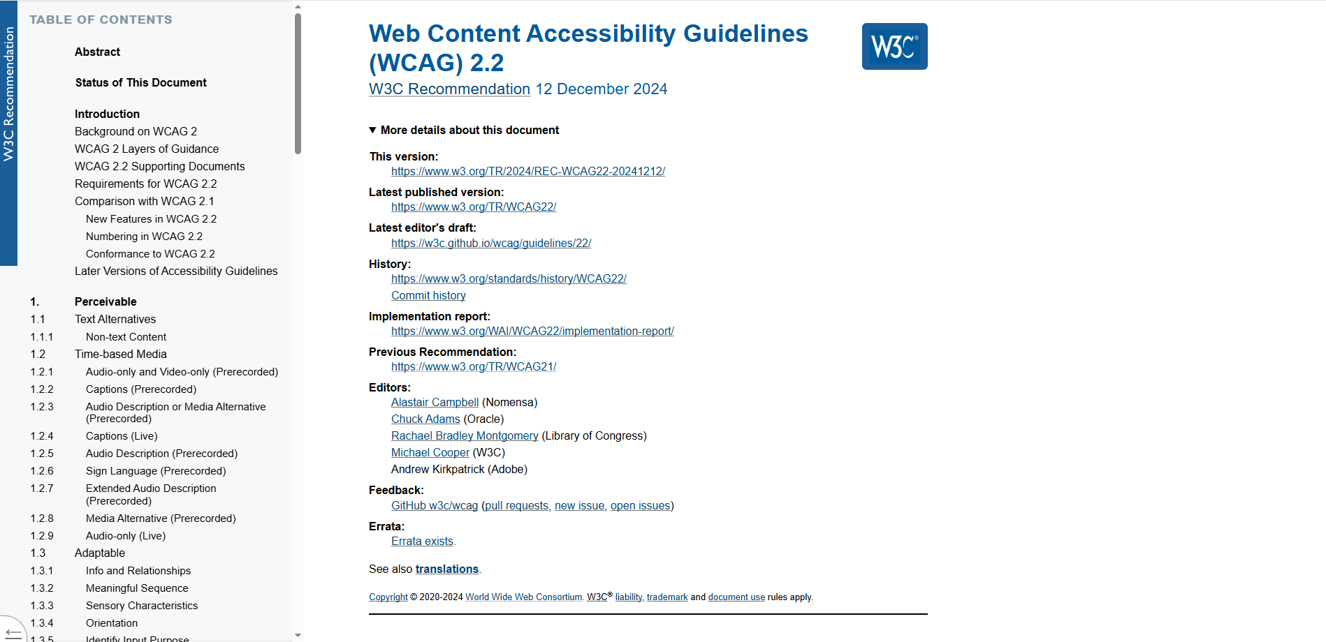
Figure 42. Application of conspicuous headings and subheadings used to mark individual chapters on the website W3C
Task: Review the website of the Ombudsman for Persons with Disabilities of the Republic of Croatia and observe the accessibility features it offers.
Background Colour
Font Face
Font Size
Text Colour
Font Kerning
Image Visibility
Letter Spacing
Line Height
Link Highlight
Paragraph Width
Text Alignment